My journey towards a new user interface
One thing I learned from building a new UI is that it's not possible to build a UI in one go and have it deployed to the user. The reason being that major UI changes forces users to relearn the user interface making for a bad experience. So, as much as I wish to throw the new UI out there immediately, I'll need to go through multiple stages of internal / beta testing before I put it out in the wild.
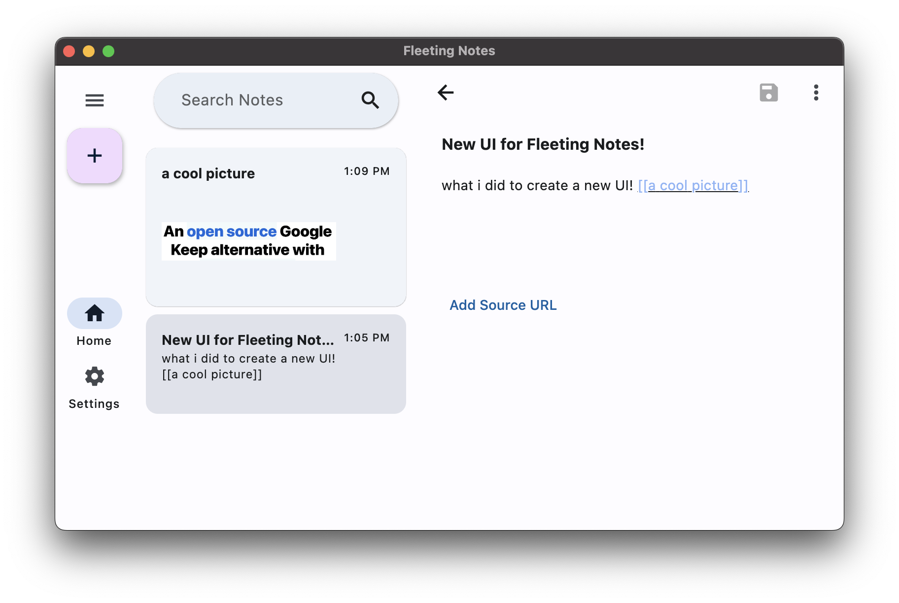
When I first tried to design a UI by myself I had a grand plan to completely re-work my way, but I soon realized that I was only complicating the UI. After a few conversations with my UI designer, I realized that the interface needed to be optimized for the main workflows of the app which is to take notes quickly, build links, and find notes created from the past. What I had created was complicated to learn, had unexpected behaviours from certain interactions and required documentation to know what was going on. That being said, I'm glad I realized this before I put it out into the world. If you're interested in what I have created so far, you can try it out at this link or just look at the screenshot below:
 As of this writing, I'm currently waiting for my UI designer to get back to me with some new iterations of the UI. The plan is to continue to iterate on the design up until Feb 10 and finalize the design there. Once I do that I'll need to integrate that into the app which will take a few days and I estimate we'll have the new UI released mid-late february.
By the way, if you're interested in doing some beta testing, schedule a meeting with me for some UI testing trials!